top of page
Project overview

The product:
Show ticket is a mobile ticketing app for a movie theater. Show tickets offers users to easily book movie tickets without spending too much time on the app. They aim to target users in between the age of 18-35.
Project Duration:
September 2021 to November 2021
The Problem:
Busy working people lack the time to spend too much on mobile phones or booking tickets online.
The Goal:
Busy working people lack the time to spend too much on mobile phones or booking tickets online.
My Role:
UX designer designing an app for Show Ticket from Conception to ticket confirmation.
Resbonsibilities:
Conducting interviews, paper and digital wireframing, low and high-fidelity prototyping, conducting usability studies, accounting for accessibility, and iterating on designs.
User Research:
Summary:
I Conducted Primary research to understand and empathize with the users that I'm designing for in order to fulfill their goals. The research showed that the working adults have busy schedules and less time to focus on other activities including booking tickets.
Pain Points:
Time:
Most of the working adults have busy schedules and less time to focus on other activities.
Accesibility:
Platforms for booking tickets have many navigation and payment issues.
Persona:
Problem Statement:
Kopila Pariyar is a hardworking busy adult who wants to easily book movie tickets because they don’t have enough time to spend too much on mobile phones.

User Journey Map:
Mapping Kopila’s user journey revealed how helpful it would be to add images and better navigation menu.
![Google UX Design Certificate - User Journey Map [Template] (1).png](https://static.wixstatic.com/media/c9aba8_2771abaf85d34904a0ae512556efebdd~mv2.png/v1/fill/w_902,h_507,al_c,q_90,usm_0.66_1.00_0.01,enc_avif,quality_auto/Google%20UX%20Design%20Certificate%20-%20User%20Journey%20Map%20%5BTemplate%5D%20(1).png)
Paper Wireframes:
Taking the time to draft iterations of each screen of the app on paper ensured that the elements that made it to digital wireframes would be well-suited to address user pain points.
For the home screen, I prioritized a quick and easy booking process to help users save time.

I have also created five different version of the same screen and drew the final screen page on a separate paper.

Digital Wireframes:
.png)

This button on top of the homescreen makes it easier for user to find out latest movies that are being played on theaters.
This element along with the text written above and below helps the users find what movies are coming soon and what movies are being played on theater.

.png)

This Element gives a brief description of the selected movie which can be useful to users

This button provides an option for users to watch the trailer before booking tickets.
Low-fidelity prototype:
Usability Study: Findings
I conducted two rounds of usability studies. Finding from the first study helped guide the designs from wireframes to mockups. The second study used a high-fidelity prototype and revealed what aspects of the mockup needed refining.
Round 1 findings:
1)
2)
Users want a page for profile.
Users want more detailed description.
Round 2 findings
1)
2)
Users want a contrast between fonts and colours.
Users want a cancel button.
Mockups:
After usability studies, I made some changes to the main mockups which includes a page for navigation bar and a separate page for profile.
Before usability study
After usability study
.png)


.png)
.png)
Before usability study
After usability study
.png)


The second usability study revealed frustrations of users being not able to properly read text and find it too cohesive. After usability study, I added different colours to create a nice contrast.
Main mockup screens for display:

.png)
.png)

High-fidelity prototype:
Link to high-fidelity prototype
Accessibility Consideration:
1
Used Icons along with text to help the users easily complete the task.
2
Used navigation bars to organize all the important contents on a vertical line.
3
Used three main colors to create a contrast between text and colors.
Style guide:
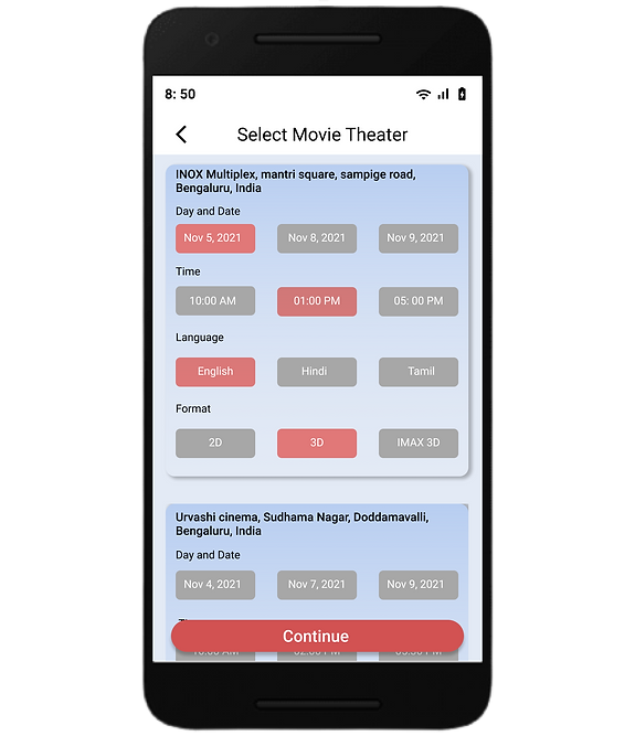
I have mostly used peachy red with light blue color which gives a nice contrast and makes the text more easy to read for the users. For the typography I have mostly used "Roboto font" in two different styles and sizes which is either regular and medium. These fonts makes the app more visually appealing and user-friendly. For the buttons, I have used three large size buttons in different colors and two small size buttons for selection which let the users know that grey color button is the unselected button while the peachy red color button is the selected one.
.png)
Takeaways:
Impact:
Most of the users find this app quite easy to use although I'll conduct more usability study in future to ensure if my app lacks something.
What I learned:
While designing the show ticket app, I learned that the first ideas for the app are only the beginning of the process. Usability studies and peer feedback influenced each iteration of the app design.
Let's connect!
bottom of page

